Hospital Identity Verification SystemUX Case Study 2024
Case Study 01
Hospital Identity Verification System
A B2B product website and patient-facing kiosk experience for healthcare identity verification.

The problem
Patient identity errors create safety, financial, and compliance risks for healthcare providers.
21,000
Opioid pills obtained through prescriptions using stolen medical identities
Source: U.S. Department of Justice, 2018
840,000
Fraudulent health insurance claims detected in 5 years
Source: National Assembly Health & Welfare Committee (Korea), 2024
900+
Patient safety incidents caused by skipped patient identification in 3 years
Source: Korea Institute for Healthcare Accreditation, 2019
Hospitals needed a reliable way to verify patient identity—and a clear way to understand and adopt the system.
The research
We combined qualitative research with behavioral data to identify friction across both the B2B website and patient-facing kiosk experience.
30+
User tests
Observed task behavior, confusion points, and usability issues
5
Focus groups
Explored expectations, trust, and adoption needs


1,000+
Behavior logs
Tracked hesitation, retries, and drop-off patterns
Hospitals needed clearer product communication; patients needed a faster, more guided verification flow.
Meet the patient.

Goal
Complete identity verification quickly and independently.
Needs
- Clear step-by-step guidance
- Immediate feedback
- Fast completion
- Minimal repeated steps
Behavior
Patients often check in under time pressure and prefer to complete verification without staff assistance.
What made the original kiosk difficult to use?
Research revealed friction around repeated steps, unclear guidance, and limited system feedback.
Original kiosk
01Unclear confirmation
Patients were not always sure whether the ID scan had been successfully recognized.

02Unclear transition
The reason for moving from ID scanning to facial verification was not clearly explained.

03Limited system feedback
Patients received little feedback while the system was processing the face match.

Where patients dropped off
Behavior logs, first-time verification
-
Start100%
-
Scan ID86%
-
Face Match68%
86% → 68%·Largest drop·−18 pts
-
Complete Verification54%
The largest drop-off occurred between ID scanning and facial verification, where patients lacked clear confirmation, transition guidance, and system feedback.
What did patients need?
Three principles shaped the redesign.
01
Clear Guidance
Know what to do next.
02
Instant Feedback
Know when it worked.
03
Faster Return Visits
Skip unnecessary steps.
Design direction
Simplicity during verification.
How was the kiosk redesigned?
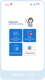
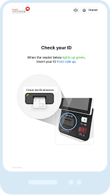
01 · Clear guidance
One action per screen.
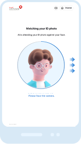
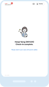
02 · Instant feedback
Always show system status.
First visit
- Choose method
- Scan ID
- Face Match
- Complete
03 · Faster return visits
Reduce repeated verification steps.
Skip ID scanning and reuse registered biometric data.
Return visit
- Last 4 digits
- Face Match
- Confirm
- Complete
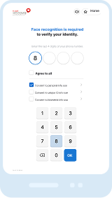
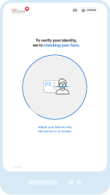
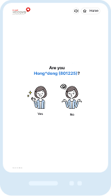
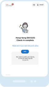
Clearer first visits. Faster return visits.
Outcome
What changed for patients?
After the redesign, patients verified faster, completed more often, and dropped off less.
Verification time
Faster first-time check-in
Task completion
More patients finished the flow
Drop-off rate
Fewer patients abandoned verification
Simplicity during verification led to faster completion and lower drop-off.
Transition
How does the website support the kiosk?
Before patients can use the kiosk, hospitals first need to understand, trust, and adopt it.
Kiosk Patient
Simplicity during verification.
Helps patients verify quickly and confidently.
Website Hospital buyer
Clarity before adoption.
Helps hospital decision-makers understand, trust, and adopt the kiosk.
Understanding the Hospital Decision-Maker

Goal
Decide whether the kiosk is worth adopting.
Needs
- Understand the product quickly
- See how it fits the hospital workflow
- Trust its security and reliability
- Know what happens after adoption
Behavior
Hospital decision-makers research and compare the product online before contacting sales.
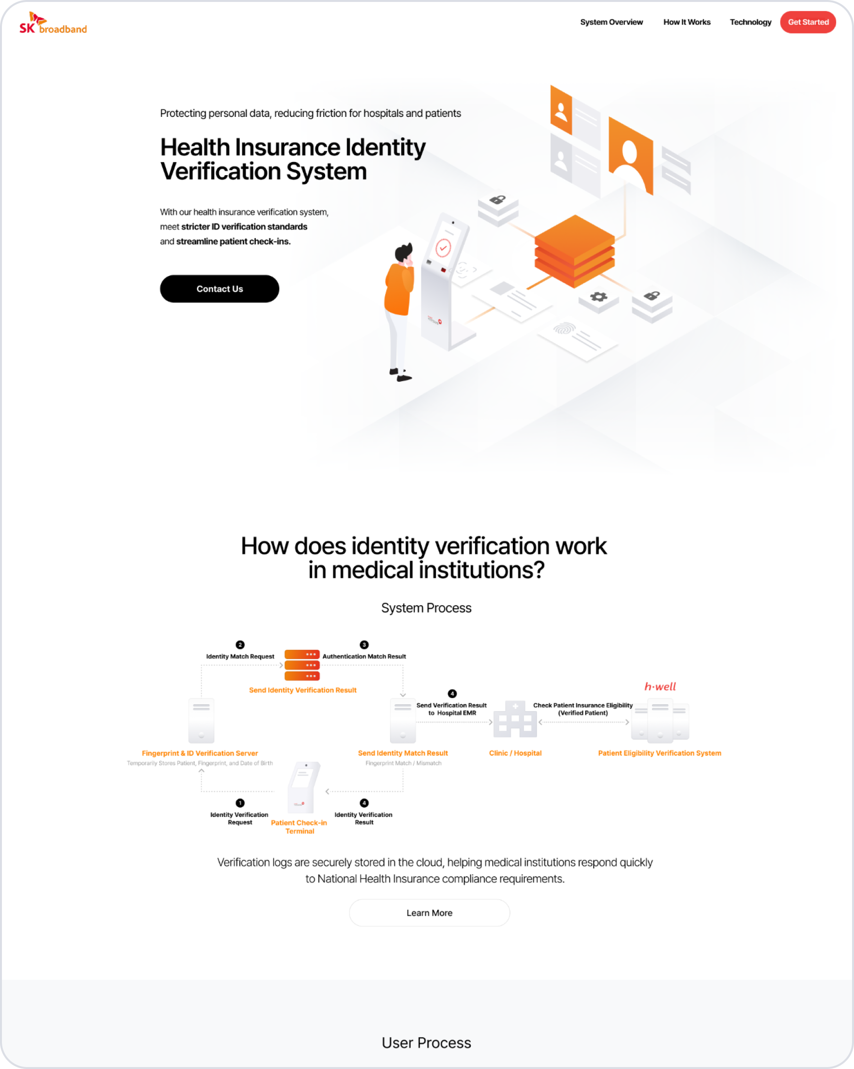
What made the original website difficult to evaluate?
100+ user tests and 5 focus groups revealed three recurring barriers in the original product site.
Original website
 01
02
03
-
01 · Unclear product value
Buyers could not quickly understand what the kiosk did or why it mattered.
-
02 · Fragmented product information
Benefits, workflow, and system details were scattered across the site.
-
03 · Low confidence before adoption
Security, reliability, and workflow fit lacked clear proof.
Behavioral baseline
Original product site, before the redesign
15%
CTA click-through
Visitors who clicked a product or inquiry CTA
30%
Key-section completion
Visitors who reached the final evaluation sections
5%
Inquiry conversion
Qualified adoption inquiries per product-site visitor
Placeholder · add measured baseline values
Buyers needed a clearer product story before they could trust and consider adopting the kiosk.
What did hospital buyers need?
Three principles shaped the website redesign.
01
Clear Value
Understand what the kiosk does.
02
One Product Story
See the full process in one flow.
03
Proof of Trust
Feel confident before adopting.
Design direction
Clarity before adoption.
Understand first. Decide with confidence.
V1
Restructure the information flow
Assumption
If each section answers one key buyer question in sequence, hospital decision-makers can evaluate the product without backtracking.
Design changes
- 1Reorganized the site around the buyer journey:
What is it?→Why do we need it?→How does it work?→Can we trust it?→What’s next?
- 2Grouped benefits, process, proof, and support into one linear story.
User feedback
“The product was easier to follow, but the experience still felt too technical and visually impersonal.”
Next step V2
Keep the clearer structure, but explore a visual system that builds trust and makes the product easier to understand at a glance.
Wireframe
V2
Test the visual direction
Built on V1 feedback
Both concepts used the same information architecture and content. Only the visual direction changed.
Hypothesis
A more approachable and product-focused visual system would increase buyer engagement and confidence.
Live A/B test
Half of visitors saw Type A and half saw Type B, while content and structure remained identical.
Decision
Type A drove stronger engagement and clearer product understanding, so it became the final visual direction.
Type A · Selected
Visual treatment
Product-led illustration · Stronger hierarchy · Clearer visual guidance
Test result
- 18% CTA click-through
- 82% scroll completion
- 2:14 avg. engagement
Type B
Visual treatment
Lifestyle photography · More editorial presentation
Test result
- 11% CTA click-through
- 64% scroll completion
- 1:41 avg. engagement
V3
Putting it all together
V2 validated the visual direction. V3 applied it across the full buyer journey.
01
Clarify the product immediately
Main banner
A focused hero explains what the kiosk is and why hospitals need it at a glance.
Solves Problem 01 · Unclear product value
02
Turn complexity into a guided story
Usage guide · Step-by-step · ID verification · Architecture
Card-based explanations and sequential flows make complex verification easier to scan and understand.
Solves Problem 02 · Fragmented information
03Key refinement
Make trust visible
System features · Security · AI verification
Security, reliability, system architecture, and AI verification become visible proof points.
Solves Problem 03 · Low confidence before adoption
04From trust to action
Turn confidence into action
Guide download · Contact / inquiry CTA
Clear CTAs give buyers an obvious next step once they understand and trust the product.
Moves confidence toward adoption
CTA click-through
18%→22%
Scroll completion
82%→88%
Avg. engagement
2:14→2:31
Result
V3 outperformed V2 and launched as the final hospital-facing experience.
Overall impact
The outcome.
After launch, the redesigned experience improved patient verification, buyer engagement, and product adoption.
60s → <15s
Verification time
Median first-visit completion time
+70%
Task completion
Increase in successful verification completion
−50%
Drop-off rate
Reduction in abandoned verification sessions
18% → 22%
CTA click-through
Visitors who clicked a primary product or inquiry CTA
82% → 88%
Key-section completion
Visitors who reached the final product sections
2:14 → 2:31
Avg. engagement
Average engaged time on the product site
+67%
Adoption inquiries
Increase in qualified product inquiries after launch
420
Healthcare organizations adopted
300
Kiosks deployed
+30%
Sales growth after launch
$2.1M
Average contract value
 Sok Joeun Internal Medicine
01 Faster Patient Check-In
“The new system has significantly reduced check-in time, allowing our staff to focus more on patient care.”
 Breathing & Internal Medicine
02 Improved Staff Efficiency
“Our staff can now manage patient verification more efficiently, especially during busy hours.”
 Neulbom Internal Medicine
03 Easy Integration
“The verification system fits smoothly into our existing workflow without requiring major changes to our daily operations.”
 Lumir Dermatology
04 Better Patient Experience
“Patients find the verification process much easier to follow, even those who aren’t familiar with digital kiosks.”
 IEUM Dermatology
05 Greater Confidence in Security
“Having a clear and secure identity verification process gives us greater confidence in managing patient information.”
 Seoultone Dermatology
06 Overall Operational Improvement
“Since introducing the system, we’ve seen a noticeable improvement in how smoothly our front desk operates.”
Result
One system, measurable impact on both sides: faster verification for patients and stronger adoption for hospitals.
Reflection
What I learned.
This project taught me to design across physical interaction, behavioral testing, and business impact.
01
Designing for a physical kiosk
My first kiosk project taught me to design for context, speed, hardware interaction, and immediate feedback.
02
Testing behavior, not preference
I learned to validate decisions through CTA clicks, scroll completion, task completion, and drop-off—not just preference.
03
Connecting UX to adoption
I learned that clearer UX can improve engagement, adoption, and business outcomes—not just usability.
I designed both sides of one system—from helping patients verify faster to helping hospitals make clearer adoption decisions.